The Best Nonprofit Logos to Learn From
This is a guest post by Joe Callahan, co-founder and VP of design at Classy.org. Here, he shares examples of awesome nonprofit logos and tips to design your own.
Your nonprofit’s logo is a key visual representation of your brand. It should not only be memorable and aesthetically pleasing, but also clearly communicate your organization’s purpose and mission. When this visual identity is well-designed and reminds supporters of what you stand for, people are more likely to identify with your brand and its values and support the cause.
Whether you’re drafting your brand’s visual identity for the first time, or completely revamping it, you can find inspiration and guidance from the best. Feast your eyes on the following nonprofit logos and learn what makes them stand out from the crowd.
1. WWF
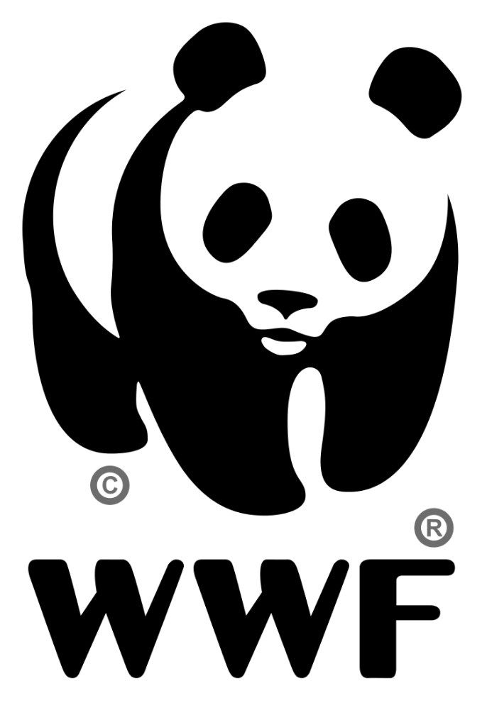
The World Wildlife Fund (WWF) boasts one of the most recognizable and memorable identities in the nonprofit space. Not only does the panda illustration speak to the organization’s mission to conserve wildlife, but it also uses negative space brilliantly. The positive space (black) gives just enough definition to the panda, so that a viewer’s eye can complete the lines of the head and body on their own.
Because the nonprofit logo uses a single color, it’s very adaptive to different mediums. You can easily manipulate single-colored logos to work on any type of background color or image. You can also translate them into stickers, screenprinting, and embroidery.
The sans-serif typeface also gives a modern look to a brand that’s over 50 years old. Unlike serif fonts (think Times New Roman) that are more classic, elegant, and formal, a sans-serif type is most commonly associated with feeling modern, friendly, direct, clean, and minimal.
2. Voices of Youth
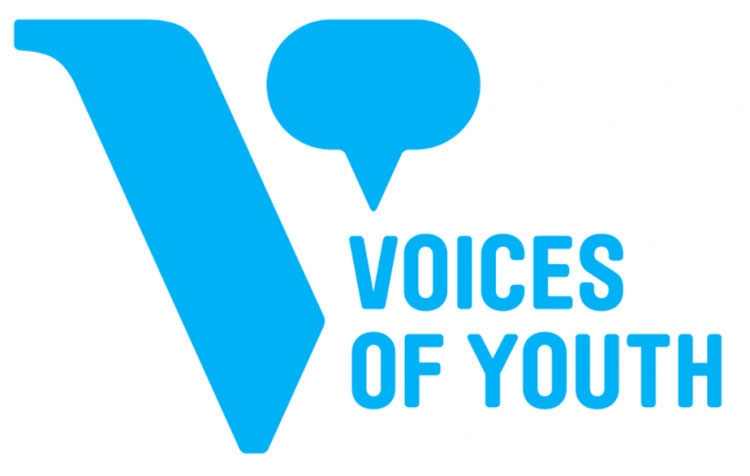
Voices of Youth, an organization launched by UNICEF to help young people around the world exchange ideas and opinions, uses a clever typographic solution that conveys their mission. Bold and striking, this nonprofit logo manages to use the speech bubble in a refreshing way that still creates balance across the large letter “V.” The “V” is also so visually strong that it can represent the brand with or without the text.
The shapes and bright colors make this logo youthful and memorable.
3. Goodwill
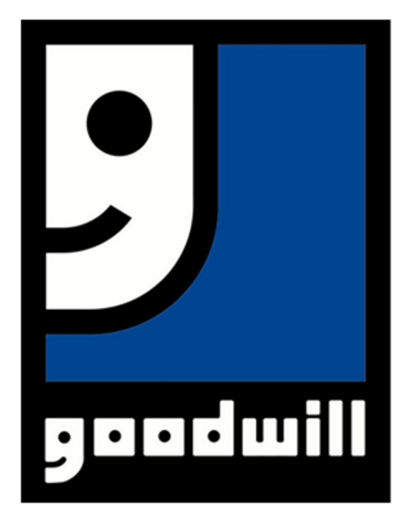 Designed in 1968 by Joseph Selame, this is a great example of how a well-designed logo can stand the test of time. Goodwill uses the lowercase “g” in its name to shape a smiling face, a symbol of the organization’s values to help people reach their full potential. The face illustration, crafted by the black outlines and shapes, is another great use case of negative space.
With the face aligned to the left and the blank space to the right, the nonprofit logo also gives off a unique, off-centered look.
4. The Water Trust
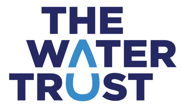
Unsurprisingly, many water-related nonprofits use a water drop illustration in their logo as an easy way to convey their mission. Here, The Water Trust puts a unique spin on this traditional shape in order to stand out from the crowd. By stacking words to create the droplet, as well as using bright colors to draw the eye, this logo is a refreshing example of how you can leverage letters to design shapes.
5. Iraq and Afghanistan Veterans of America
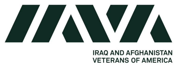
This contemporary wordmark, or text-only logo, from Iraq and Afghanistan Veterans of America (IAVA) balances a hip and modern feel while emanating honor, gratitude, and pride. It just looks and feels military, like a badge on the sleeve or chest. One cool thing to note is that it reads IAVA in both positive (black) and negative (white) space.
6. Mind
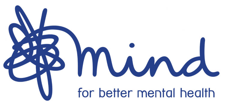
Mind is an organization that empowers people experiencing mental health issues. Their scribbled and handwritten logotype is a beautiful example of strong symbolism through simplicity. The abstract shape evokes initial chaos and confusion and then transitions nicely into a balanced cursive type. The handwriting also comes across as very human and approachable. This logo is simple, but not basic. It’s playful, but not childish.
7. Natural Resources Defense Council
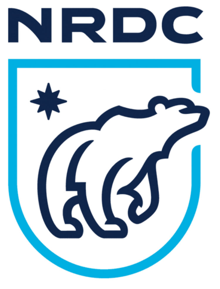 The Natural Resources Defense Council (NRDC), an environmental advocacy organization, evokes strength and progress through their logo with the bear illustration. The movement in the bear’s pose suggests action and curiosity. The typeface is wonderfully done, with a nice modern sans-serif and a rounded shape that mimics the shape of the blue crest.
As a key representation of your organization, your nonprofit logo deserves attention throughout the years. It is a tool to connect with new generations and supporters. Even the most established brands recognize that they must adapt and make small iterations to their logo to stay relevant and timely. As you explore the endless ways to depict your brand through color, shapes, and typography, just remember to keep things simple, think of your audience, and always focus on communicating your mission.
The Nonprofit Growth Guide
Subscribe to the GoFundMe Pro blog
Get the latest fundraising tips, trends, and ideas in your inbox.
Thank you for subscribing
You signed up for emails from GoFundMe Pro


Request a demo
Learn how top nonprofits use GoFundMe Pro to power their fundraising.