Sticky donate button gets more donors to checkout
Test period: September 2025 through October 2025
Hypothesis:
We know donors don’t always decide to give the moment they land on a campaign page — often, they’re inspired as they scroll through powerful stories, images, and impact details. But on mobile, that journey can also mean losing sight of the main call to action as they scroll down.
We hypothesize that keeping the “Donate” button visible as mobile donors explore the page — through a floating, mobile-optimized CTA — will serve as a helpful reminder at the right moment of inspiration. By staying persistently in view, the floating donate button will encourage more donors to start the checkout process and ultimately complete their gift.
Design:
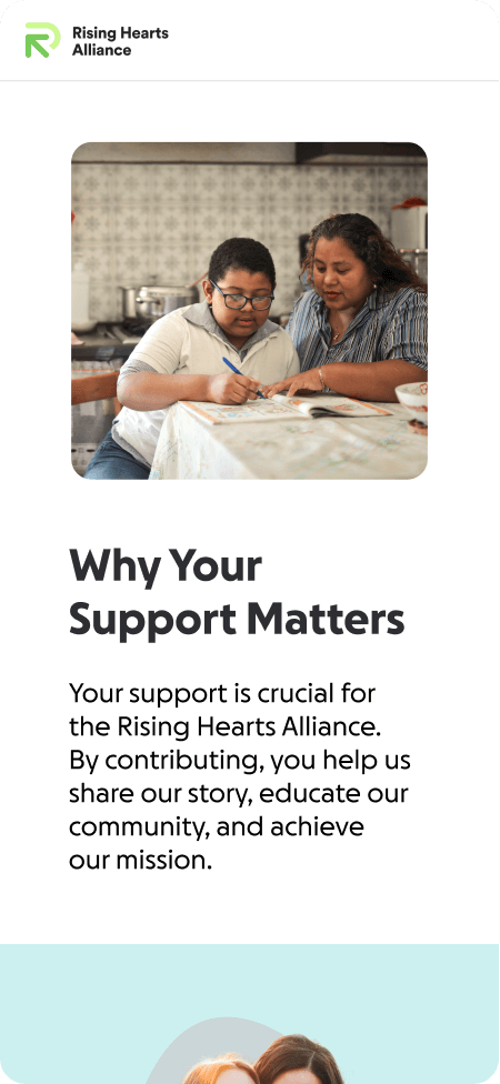
Control
- Donation page without a sticky donate button

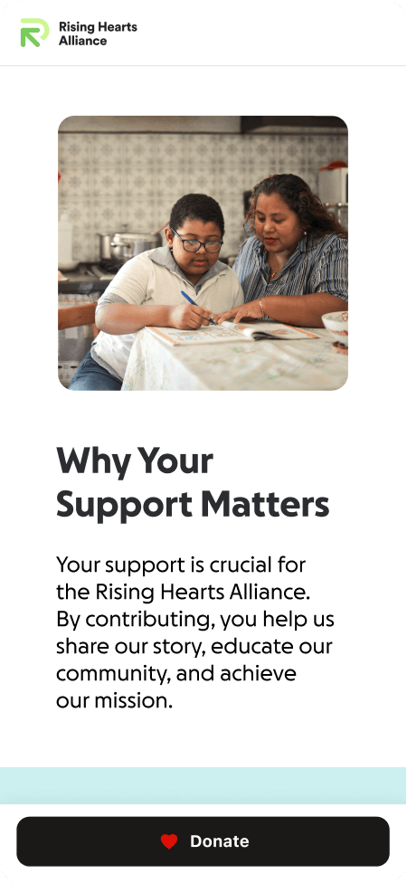
Test
>5%
- Mobile view with a sticky donate button feature

Results:
| Name | Control | Challenger |
| Checkout entry rate | Baseline | +5.09%* |
| Time to click | Baseline | -1.83% |
Key learnings:
The floating donate button effectively increased donor engagement and reinforced giving intent across mobile experiences. Our primary metric, checkout entry rate saw a statistically significant 5.1% lift, confirming that keeping the CTA visible drives more donors into checkout. Time to click also decreased 1.83%, signaling frictionless navigation to checkout. Overall, the results validate that maintaining a visible path to give helps more mobile donors act on their inspiration — translating attention and emotion into donations.
So what: Based on the findings, we’re releasing this feature to all Studio campaign pages with a single donation block–a best practice baked into every campaign template–to enhance the mobile giving experience and boost fundraising results. This means customers no longer need to add multiple donation blocks on longer campaign pages; donors will never lose sight of the donate button, no matter how much content is on the page.